| C# Sample Programs |
Site Top > C# Sample Programs > C# Sample Programs > ASP.NET Core > Razor Pages
Display error items in red
04/15/2024
This article deals with ASP.NET Core Razor Pages.
All sample programs in this article are based on the Visual Studio Project template "ASP.NET Core Web App" and you must add the Razor pages in th Pages folder.
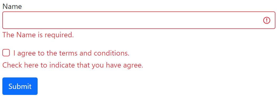
Display error items in red
In this example, When you click the submit button, only the items with errors are displayed in red. The items without errors don't change their outlook.
Note: When combined with client-side validation, it may not work.
BootstrapError.cshtml.cs
using Microsoft.AspNetCore.Mvc;
using Microsoft.AspNetCore.Mvc.RazorPages;
using System.ComponentModel.DataAnnotations;
using System.ComponentModel;

namespace WorkStandard.Pages.validationlook
{
    public class BootstrapErrorModel : PageModel
    {
        [BindProperty]
        [DisplayName("Name")]
        [Required(ErrorMessage = "The {0} is required.")]
        public string? UserName { get; set; }

        [BindProperty]
        [DisplayName("I agree to the terms and conditions.")]
        [AllowedValues(true, ErrorMessage = "Check here to indicate that you have agree.")]
        public bool LicenseAgreement { get; set; } = false;

        public void OnPost()
        {
            if (!ModelState.IsValid)
            {
                return;
            }

            System.Diagnostics.Debug.WriteLine("No errors");
        }
    }
}
→ Where Debug.WriteLine appear
BootstrapError.cshtml
@page
@model WorkStandard.Pages.validationlook.BootstrapErrorModel

<form method="post">
    <div class="mb-3">
        <label asp-for="UserName"></label>
        <input asp-for="UserName" class="form-control" />
        <span asp-validation-for="UserName" class="text-danger"></span>
    </div>
    <div class="mb-3">
        <div class="form-check">
            <input asp-for="LicenseAgreement" class="form-check-input" />
            <label asp-for="LicenseAgreement" class="form-check-label"></label>
        </div>
        <div>
            <span asp-validation-for="LicenseAgreement" class="text-danger"></span>
        </div>
    </div>
    <div>
        <input type="submit" class="btn btn-primary" />
    </div>
</form>

@section Scripts
{
<script>
    @* Add is-invalid class when the item has input-validation-error class.*@
    var umaUtil = umaUtil || {};
    umaUtil.TurnOnBootstrapError = function (doc) {
        const fields = doc.querySelectorAll('.input-validation-error');
        fields.forEach(field => {
            field.classList.add('is-invalid');
        });
    };
    umaUtil.TurnOnBootstrapError(document);
</script>

}
Note: When combined with client-side validation, it may not work.
The CSS classes...
- mb-3 Set little margin at bottom.→ Spacing
- form-control Make the input a Bootstrap look.→ Forms
- text-danger The string become red to indicate danger.→ Theme colors
- form-check form-check-input Give the input a Bootstrap look. → Checks
- form-check form-check-label Give the label a Bootstrap look.→ Checks
- btn btn-primary Give the button a Bootstrap look to indicate that it's a key feature.→ Buttons
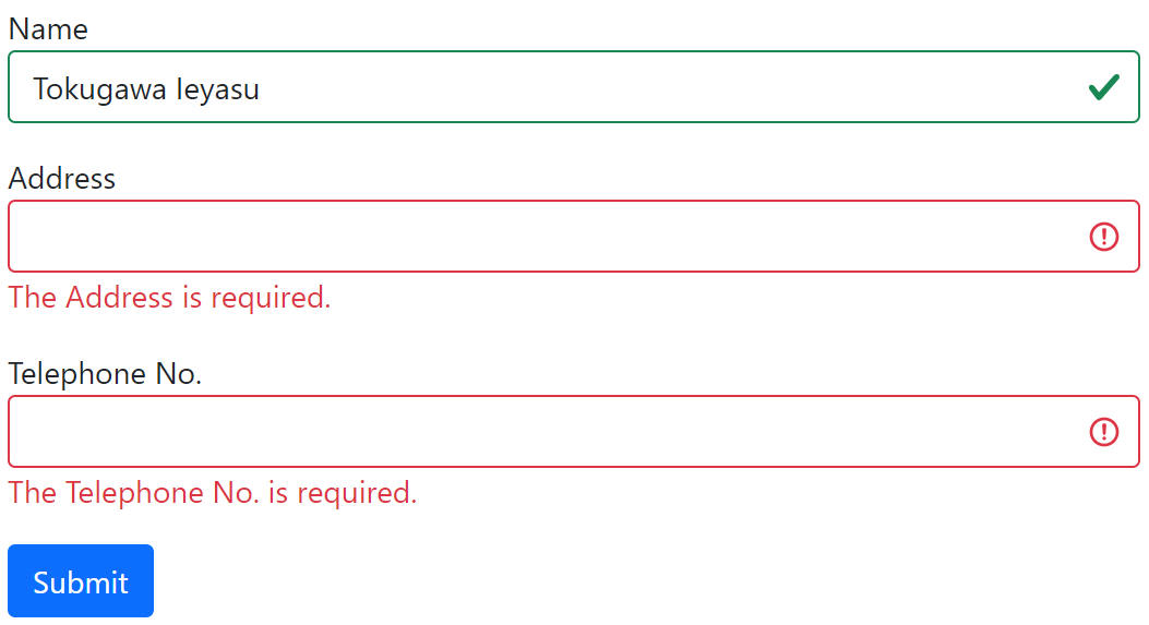
Display error items in red and the others in green
Note: When combined with client-side validation, it may not work.
BootstrapValidationResult.cshtml.cs
using Microsoft.AspNetCore.Mvc;
using Microsoft.AspNetCore.Mvc.RazorPages;
using System.ComponentModel.DataAnnotations;
using System.ComponentModel;

namespace WorkStandard.Pages.validationlook
{
    public class BootstrapValidationResultModel : PageModel
    {
        [BindProperty]
        [DisplayName("Name")]
        [Required(ErrorMessage = "The {0} is required.")]
        public string? UserName { get; set; }

        [BindProperty]
        [DisplayName("Address")]
        [Required(ErrorMessage = "The {0} is required.")]
        public string? Address { get; set; }

        [BindProperty]
        [DisplayName("Telephone No.")]
        [DataType(DataType.PhoneNumber)]
        [Required(ErrorMessage = "The {0} is required.")]
        public string? PhoneNumber { get; set; }

        //At first time, value is set to "False", and the after time, it will be "True".
        public string IsValidated { get; set; } = "False";

        public void OnPost()
        {
            IsValidated = "True";

            if (!ModelState.IsValid)
            {
                return;
            }

            System.Diagnostics.Debug.WriteLine("No errors");
        }
    }
}
→ Where Debug.WriteLine appear
BootstrapValidationResult.cshtml
@page
@model WorkStandard.Pages.validationlook.BootstrapValidationResultModel

<form method="post">
    <div class="mb-3">
        <label asp-for="UserName"></label>
        <input asp-for="UserName" class="form-control" />
        <span asp-validation-for="UserName" class="text-danger"></span>
    </div>
    <div class="mb-3">
        <label asp-for="Address"></label>
        <input asp-for="Address" class="form-control" />
        <span asp-validation-for="Address" class="text-danger"></span>
    </div>
    <div class="mb-3">
        <label asp-for="PhoneNumber"></label>
        <input asp-for="PhoneNumber" class="form-control" />
        <span asp-validation-for="PhoneNumber" class="text-danger"></span>
    </div>
    <div>
        <input type="submit" class="btn btn-primary" />
    </div>
    @* At first time, value is set to "False", and the after time, it will be "True" *@
    <input type="hidden" id="IsValidated" value="@Model.IsValidated" />
</form>

@section Scripts
{
<script>
    var umaUtil = umaUtil || {};
    umaUtil.TurnOnBootstrapError = function (doc) {
        @* Add is-invalid class when the item has input-validation-error class.*@
        @* In other case, add is-valid class.*@
        const fields = doc.querySelectorAll('input, select, textarea');
        fields.forEach(field => {
            if (field.classList.contains('input-validation-error')) {
                field.classList.add('is-invalid');
            } else {
                field.classList.add('is-valid');
            }
        });
    };

    @* Except for the first time, apply the appearance of the Bootstrap.*@
    const requestCountField = document.querySelector('input#IsValidated');
    if (requestCountField.value != 'False') {
        umaUtil.TurnOnBootstrapError(document);
    }
</script>
}
Note: When combined with client-side validation, it may not work.
The CSS classes...
- mb-3 Set little margin at bottom.→ Spacing
- form-control Make the input a Bootstrap look.→ Forms
- text-danger The string become red to indicate danger.→ Theme colors
- btn btn-primary Give the button a Bootstrap look to indicate that it's a key feature.→ Buttons